6 Exploratory analysis
Now that I have the template created, I start to explore and analyze the data to answer certain questions like:
- What is the platform that I have used the most to listen?
- How my edge tendencies have changed over the years.
- Who are my favorite artists?
- It will be possible to analyze my state of mind through the years. ?
I have decided to split the data as follows:
- Overall : General data of my listening patterns.
- Platform and Geo : Analysis of the devices that I have used to listen to music and the geolocations where I have done it.
- Artists : Analysis of artists over time.
- Listening time : My favorite artist will be the same one that I listen to the most?
6.1 Overall

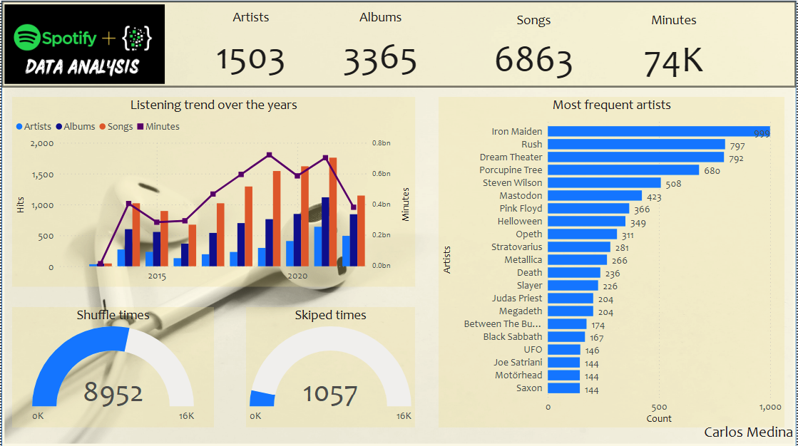
6.1.1 Listening trend over the years - Line and clustered column chart
In this graph I can see relevant points for me:
- I started paying for Spotify at the end of 2013, I think this date coincides with the arrival date of the service in Colombia, which was where I lived at the time.
- Trends were always on the rise, every year there were more artists and therefore more albums to listen to.
- In the years 2020 and 2021, the years of the pandemic were where I listened music the most, this is likely due to the long periods of quarantine to which the city where I live was subjected.
6.1.2 Shuffle and skipped times - Gauge
Here I show how of all the records I have, I have listened to more than half in random mode, but very rarely do I skip a song. I think this is directly correlated with the upward trends, since my favorite Spotify lists are the personalized mixes that the platform creates for you, and these mixes give you the opportunity to listen more and more artists according to your tastes.
6.1.3 Most frequent artists - Stacked bar char
The information in this graph is quite clear, the artists that I have listened to the most in these 9 years.
6.2 Platform and Geo

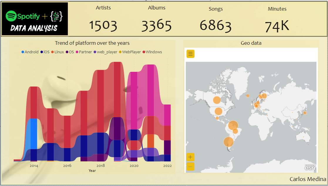
6.2.1 Trend of platform over the years - Ribbon chart
The type of device that I use the most from 2013 to 2019 was a Windows PC. This is related to the fact that the company where I worked in that period provided me with this OS.
For 2020 there are two important changes, the first change is that I buy a sound system which connects directly to Spotify and I hardly use it on the PC anymore.
The second important change in 2020 is that Mac OS (my PC) begins to have more relevance.
2020 and 2021 my sound system had more use since those were the years of the pandemic and I spent almost all my time at home.
The last time I used an Android device was in 2014.
6.2.2 Geo Data - ArcGIS maps
A self explanatory graph. My main listening places.
6.3 Artists

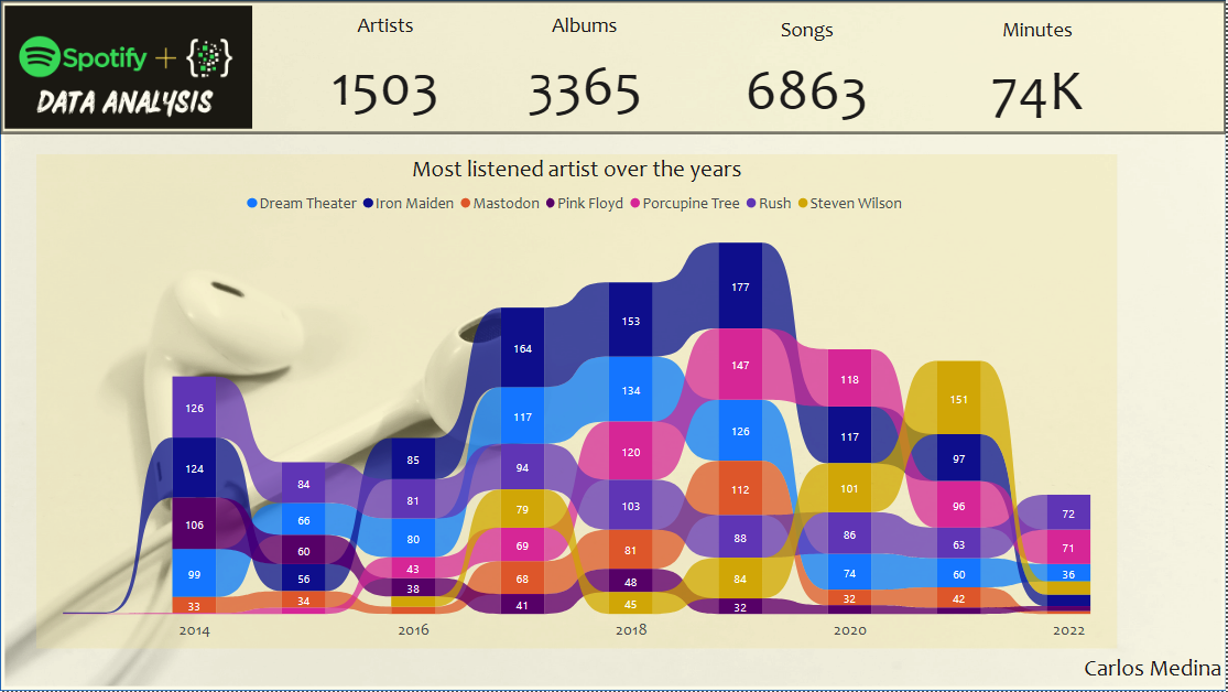
6.3.1 Most listened artist over the years - Ribbon chart
In the Overall section I showed the artists that I listen to the most, so I decided to see how they behaved over time, the graph is easy to read and Iron Maiden is always first, except for the last two years where Steven Wilson and his mutation in Porcupine Tree has taken the lead.
However, the most listened to artist is the one that I have dedicated the most time to?
6.4 Listening time

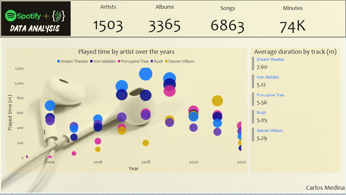
6.4.1 Played time over the years - Scatter chart
Iron Maiden is the artist I’ve heard the most songs from, however, it’s nowhere near as long as I’ve heard Dream Theater. The difference between the most listened to artist and the longest listening artist should be understood very well.
6.4.2 Average duration by track (m) - Multi-row card
To analyze this phenomenon a little more, here I show the average length of a song by these artists, and Dream Theater wins with an average length of seven and a half minutes.